Mobile App Design Workflow: A 2026 Team Guide

TL;DR:
- A structured mobile app design workflow guides teams from discovery to developer handoff, improving product quality. Skipping or rushing phases like flow mapping and early testing leads to costly redesigns and poor user experience. Prioritizing user research, detailed documentation, and platform standards results in more usable and retainable apps.
A mobile app design workflow is the structured sequence of phases, from discovery through developer handoff, that guides cross-functional teams to build intuitive, high-quality mobile applications. A standard design-to-development cycle runs 8–12 weeks, with 30–40% of that time dedicated to discovery and design phases. That upfront investment prevents the costly rewrites that derail projects later. Designers, developers, and product managers who follow a defined workflow ship better products faster. Concepts like design tokens, UX design workflow standards, and platform-specific guidelines are not optional refinements. They are the difference between a product that retains users and one that gets deleted.
What are the key phases of a mobile app design workflow?
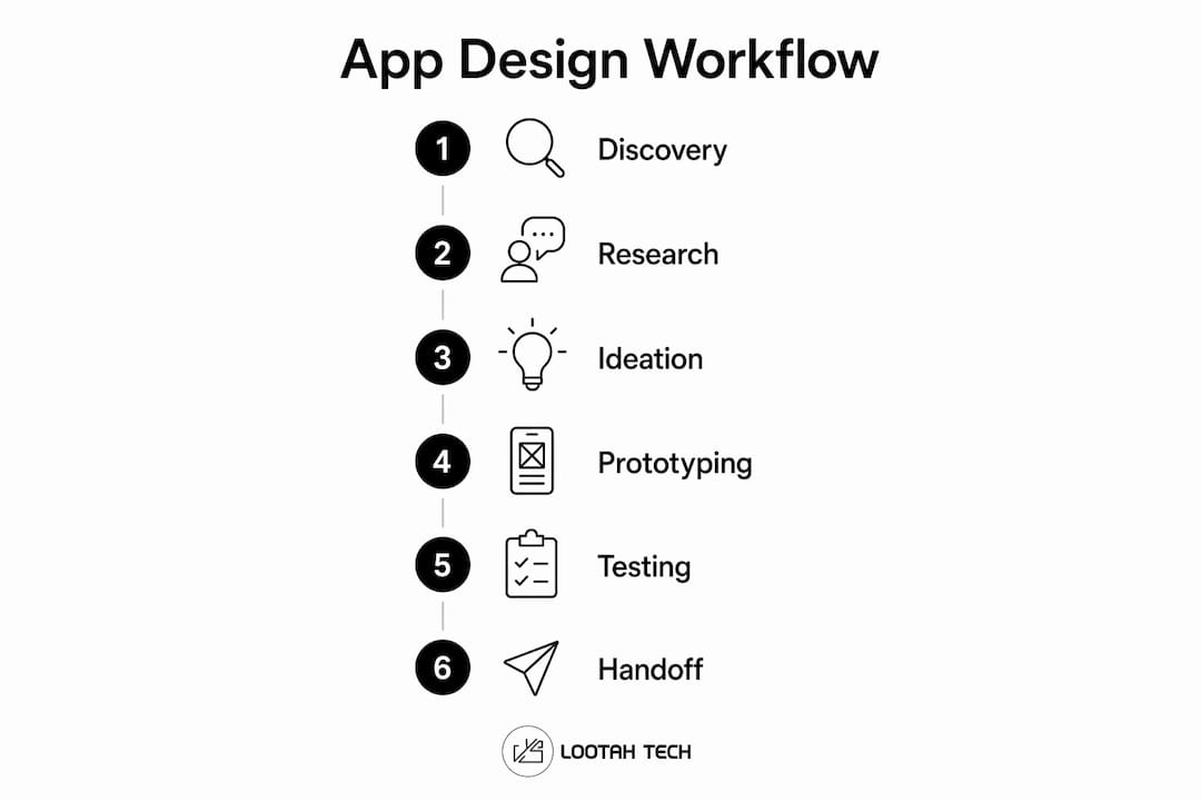
A modern mobile app design workflow breaks into six distinct phases. Each phase has a clear goal and a defined set of activities.
- Discovery. Teams conduct user interviews, competitive audits, and stakeholder workshops to surface real user needs. The goal is evidence, not assumptions.
- Definition. Insights from discovery get synthesized into problem statements and user personas. This phase sets the design direction before a single screen is drawn.
- Ideation. Techniques like Crazy Eights (sketching eight concepts in eight minutes) and dot-voting help teams generate and prioritize concepts quickly. Collaborative input at this stage prevents tunnel vision.
- Prototyping. Teams build from low-fidelity wireframes to high-fidelity interactive prototypes using tools like Figma and FigJam. The fidelity increases as confidence in the concept grows.
- Testing. Usability tests with five to eight participants catch up to 85% of usability issues when run during the wireframing stage. Running tests early costs far less than fixing problems after development.
- Handoff. Designers deliver detailed specs, design tokens, and accessibility labels to developers. Tokens that map directly to SwiftUI and Compose Material 3 systems make this phase far more efficient.
Each phase feeds the next. Skipping or compressing any one of them introduces risk that compounds downstream.
Which tools and techniques optimize each stage?

The right tool at the right stage keeps the workflow moving without creating bottlenecks. The table below maps recommended tools to each phase.
| Phase | Recommended tools | Primary benefit |
|---|---|---|
| Discovery and research | Otter, Granola, Dovetail | Transcription and AI-assisted synthesis of user interviews |
| Ideation | FigJam, digital whiteboards | Collaborative sketching and concept voting |
| Wireframing and prototyping | Figma, ProtoPie | Low-to-high fidelity prototyping in one environment |
| Usability testing | Maze | Unmoderated testing with real users at scale |
| Handoff | Design tokens in Figma | Direct mapping to SwiftUI and Compose Material 3 |
Design tokens that map to code-based systems can reduce back-and-forth communication during handoff by up to 50%. That reduction translates directly into fewer developer queries and faster build cycles.
Platform guidelines are non-negotiable at every stage. Adherence to Apple Human Interface Guidelines, Material Design 3, and WCAG 2.1 AA accessibility standards keeps the final product feeling native on both iOS and Android. Generic designs that ignore these conventions consistently underperform against platform-native ones.
Pro Tip: Use Dovetail's AI tagging feature to cluster interview themes in under an hour. Manual affinity mapping of the same data typically takes a full day.
How to execute a step-by-step app design process effectively
A defined sequence removes guesswork and keeps the team aligned from the first interview to the final build. Follow these eight steps.
-
Conduct targeted user interviews. Record every session with Otter or Granola. Aim for 6–10 participants per user segment to surface patterns without over-investing in research.
-
Translate findings into problem statements. Use the format: "As a [user type], I need [goal] because [reason]." This keeps the definition phase grounded in real user needs rather than internal opinions.
-
Run ideation workshops. Bring designers, developers, and product managers into the same session. Developer input at this stage surfaces technical constraints before they become design blockers.
-
Map user flows before designing screens. Mapping flows as logic diagrams before screen design avoids dead ends and incoherent navigation. Teams that skip this step routinely discover missing screens mid-prototype.
-
Build low-fidelity wireframes first. Wireframes in Figma take hours to revise. High-fidelity screens take days. Validate the structure before investing in visual polish.
-
Run iterative usability tests early. Test wireframes, not just finished prototypes. Five participants reveal the majority of critical issues. Schedule tests at the end of each design sprint, not after development.
-
Prepare detailed handoff specs. Include design tokens, safe area insets, accessibility labels, and interaction states. Explicitly designing for safe area insets on modern devices prevents critical UI elements from being blocked by the iOS dynamic island or Android gesture indicators.
-
Collaborate with developers during Agile cycles. UI/UX design is no longer a fixed deliverable handed off once. Designers and developers refine tokens and accessibility states together throughout each sprint. That continuous loop is what keeps the final product true to the original design intent.
Pro Tip: Schedule a 30-minute design-dev sync at the start of every sprint. Resolving ambiguity before coding begins eliminates the most common source of rework.
For teams building their first app, Yslootahtech's guide on mobile app development steps covers the development side of this process in detail.
What are common pitfalls in mobile app design workflows?
Most workflow failures trace back to a small set of recurring mistakes. Recognizing them early is the fastest way to avoid them.
- Designing screens before mapping flows. Teams that skip user flow mapping risk incoherent user experiences and costly redesigns. Flows reveal navigation gaps that screens alone cannot expose.
- Ignoring device hardware constraints. Platform-specific elements like the iOS dynamic island, notch areas, and Android gesture indicators must be explicitly designed for. Ignoring safe area insets forces developers to implement workarounds that degrade the user experience.
- Delaying usability testing. Testing after development is the most expensive form of quality assurance. Bugs found in wireframes cost a fraction of bugs found in production.
- Skipping design tokens. Manual spec sheets create ambiguity. Tokens that integrate directly with Compose Material 3 and SwiftUI remove that ambiguity at the source.
- Neglecting accessibility. Designs that do not meet WCAG 2.1 AA standards exclude users and fail app store review processes in regulated markets.
- Weak onboarding design. 77% of users abandon mobile apps within three days of installation. Effective onboarding with contextual permission requests can improve retention by 50%. Onboarding is not a screen. It is a system.
The most expensive design decision is the one made without user data. Every shortcut taken in discovery or testing shows up as a support ticket, a one-star review, or a churn spike.
Teams that want to go deeper on user engagement and retention will find practical tactics that complement a well-structured design process.
Key Takeaways
A structured mobile app design workflow, built on user research, iterative testing, and platform-specific standards, is the single most reliable path to shipping apps that users keep.
| Point | Details |
|---|---|
| Front-load discovery | Spend 30–40% of the project timeline on discovery and design to prevent costly late-stage rewrites. |
| Test at wireframe stage | Five usability participants catch up to 85% of issues. Test early, not after development. |
| Map flows before screens | User flow diagrams expose navigation gaps that screen design alone cannot reveal. |
| Use design tokens | Tokens mapped to SwiftUI and Compose Material 3 cut handoff communication by up to 50%. |
| Prioritize onboarding | Contextual permission requests and clear onboarding flows can improve 3-day retention by 50%. |
What I've learned from watching teams rush the design phase
The most consistent pattern I see in failed mobile projects is not bad design. It is a compressed design phase. Teams under deadline pressure cut discovery to a week, skip user flow mapping, and hand off screens that developers have never seen before. The result is a product that technically works but feels wrong to use.
The shift that actually changes outcomes is treating the UX/UI design process as a continuous activity rather than a gate before development. When designers sit in sprint planning and developers attend usability test readouts, the feedback loop tightens. Problems get caught in hours, not weeks.
Accessibility is the other area where I see consistent underinvestment. Teams treat WCAG 2.1 AA compliance as a checkbox for regulated industries. It is not. Accessible design produces cleaner component hierarchies, better contrast ratios, and touch targets that work for everyone. The apps that score highest on usability benchmarks almost always have strong accessibility foundations.
The tools matter less than the process. Figma, ProtoPie, and Maze are excellent. But a team using a shared Figma file with no defined review process will still ship a broken product. The workflow is the discipline. The tools just make it faster.
— YS
How Yslootahtech supports your app design and development process
Yslootahtech's application development services are built around the same integrated workflow described in this article. Design and development run in parallel, not in sequence.
The team at Yslootahtech covers every phase from user research and UX design through to native iOS and Android development, with design tokens and accessibility standards built into every project. Whether you are launching a fintech product, a digital health platform, or an enterprise tool, the process is structured to reduce rework and deliver a product that performs. Contact Yslootahtech to discuss how a defined workflow can be applied to your next mobile project.
FAQ
What is a mobile app design workflow?
A mobile app design workflow is the structured sequence of phases, from discovery and ideation through prototyping, testing, and developer handoff, that guides teams to build usable mobile applications. A standard cycle runs 8–12 weeks.
How many users do you need for usability testing?
Five to eight participants are enough to catch up to 85% of usability issues, according to Nielsen Norman Group research. Testing at the wireframe stage delivers the highest return on that investment.
Why do most mobile apps lose users so quickly?
77% of users abandon apps within three days of installation. Poor onboarding and unclear permission requests are the primary causes, and both are solvable at the design phase.
What are design tokens and why do they matter?
Design tokens are named variables that store visual decisions like color, spacing, and typography, and map directly to code systems like SwiftUI and Compose Material 3. They reduce handoff friction and keep the built product consistent with the design.
What is the biggest mistake teams make in the design process?
Designing screens before mapping user flows is the most common and costly mistake. Flow diagrams expose navigation gaps and dead ends before any screen design begins, saving significant redesign time later.