UI/UX Improvement Steps: A 5-Stage Practitioner Playbook

The fastest path to a better product is a repeatable cycle, not a redesign. Use the Diagnose → Prioritize → Fix → Validate → Monitor workflow as your primary framework for sustainable UI/UX improvement, and you will ship measurable gains without betting the product on a big-bang overhaul. That is the core claim of this playbook, and every section maps directly to one stage of that cycle.
Before you read further, here are the quick wins you can ship this week:
- Rewrite your primary CTA so it names the action ("Book a Demo" beats "Submit").
- Cut form fields to the minimum required — every extra field increases abandonment.
- Fix primary button contrast to meet WCAG AA (4.5:1 ratio for normal text).
- Add inline validation so users see field errors before they hit Submit.
- Lazy-load below-the-fold images to cut page weight without a code refactor.
These five changes address the most common friction points identified by Nielsen's 10 usability heuristics and are consistent with Baymard's research on consistency and cognitive load. They require no design system, no A/B testing infrastructure, and no stakeholder approval cycle. Ship them, measure the delta, then use the rest of this guide to build the full workflow around them.
Table of Contents
- What are the 5 UI/UX improvement steps and how do they connect?
- Stage 1: How do you diagnose real user friction?
- Stage 2: How do you prioritize which fixes will move KPIs fastest?
- Stage 3: What are the concrete UI and UX fixes that reduce friction?
- Stage 4: How do you validate that a fix actually works?
- Stage 5: How do you monitor improvements and catch regressions early?
- What are the quick wins you can ship in days?
- Which tools and templates support the full workflow?
- What do UI/UX improvements cost and how long do they take?
- Key Takeaways
- Why the "just redesign it" instinct is usually wrong
- Yslootahtech's UX audit and design services for product teams
- Further reading and authoritative sources
What are the 5 UI/UX improvement steps and how do they connect?
The five stages work as a loop, not a checklist you complete once. UX optimization is best treated as a continuous, structured cycle where monitoring feeds the next round of diagnosis. Here is the workflow at a glance:
- Diagnose — Collect quantitative and qualitative signals to locate real user friction. Purpose: know where and why users struggle before touching the interface.
- Prioritize — Score each issue by reach, severity, business impact, effort, and risk. Purpose: invest engineering and design time where it moves KPIs fastest.
- Fix — Apply targeted tactics (UI clarity, flow redesign, performance, microcopy, accessibility). Purpose: address root causes, not symptoms.
- Validate — Run A/B tests, prototype tests, or moderated usability sessions to confirm the fix works. Purpose: replace subjective opinion with evidence before full rollout.
- Monitor — Track KPIs on a dashboard, set alert thresholds, and run a regular review cadence. Purpose: catch regressions early and feed new signals back into Diagnose.
The cycle beats big-bang redesigns for one practical reason: each loop is small enough to roll back. Phased rollouts let you release changes in segments, monitor performance, and revert specific flows without risking the entire product. A team that ships and validates one flow per sprint accumulates compounding gains. A team that waits six months for a full redesign ships one bet. For teams integrating UX work into software sprints, the custom software workflow guide covers how to embed this cycle into CI/CD pipelines.
Stage 1: How do you diagnose real user friction?
Diagnosis is where most teams underinvest. They jump straight to solutions based on gut feel or stakeholder opinion, then wonder why the redesign did not move the needle. The fix is combining two signal types: quantitative data that shows where users drop off, and qualitative data that explains why.
Quantitative signals to collect first:
- Funnel drop-off rates — A significant drop on step 2 of a checkout flow is a concrete intervention trigger. Pull this from your analytics platform (Google Analytics 4, Mixpanel, or Amplitude all surface funnel reports).
- Core Web Vitals — Largest Contentful Paint above 2.5 seconds and Cumulative Layout Shift above 0.1 are measurable performance problems, not opinions.
- Error rates — High field validation error rates on a single form field signal a labeling or input-type problem.
- Rage clicks and dead clicks — Session replay tools flag these automatically; they point to broken affordances or missing interactive states.
Qualitative signals to layer on top:
- Session recordings — Watch 10–20 sessions on the specific page or flow your analytics flagged. You will see hesitation, backtracking, and accidental taps that no funnel report captures.
- Heatmaps — Attention heatmaps reveal which content users actually read versus scroll past. Click maps expose misaligned mental models (users clicking non-interactive elements).
- Moderated usability tests — Five participants following a task script will surface the root cause of a drop-off faster than any quantitative tool. Use these when you need to understand why, not just where.
- Support tickets and chat logs — Filter for UI-related complaints. Repeated phrases like "I can't find the button" or "the form keeps resetting" are direct friction evidence.
A blended approach combining funnels, usability tests, and session replays is required for accurate diagnosis. Analytics alone will send you redesigning the wrong surface. Jakob Nielsen's heuristics give you a structured lens for evaluating what you observe: visibility of system status, error prevention, recognition over recall, and minimalist design are the four most commonly violated in products that have grown organically.
Pro Tip: Before scheduling usability tests, run a heuristic evaluation against Nielsen's 10 heuristics on the flagged flow. It takes two hours and produces a prioritized issue list that makes your test script sharper and your sessions more efficient.
Stage 2: How do you prioritize which fixes will move KPIs fastest?
Not every diagnosed issue deserves a sprint. Prioritization is where you translate signals into a ranked backlog that product, design, and engineering can actually execute.
Use a five-dimension scoring matrix. Rate each issue 1–3 on each dimension, then sum the scores:
| Dimension | What to measure | Score 1 | Score 2 | Score 3 |
|---|---|---|---|---|
| Reach | % of users affected per week | <10% | 10% | — |
| Severity | Impact on task completion | Minor friction | Task slowed | Task blocked |
| Business impact | Effect on conversion, retention, or revenue | Low | Medium | High |
| Effort | Design + engineering days | >10 days | 3–10 days | <3 days |
| Risk | Likelihood of regression or side effects | High | Medium | Low |
A checkout button with wrong contrast that affects every user, blocks conversion, and takes a developer 30 minutes to fix scores 15/15. A cosmetic icon misalignment on a settings screen that affects 3% of users scores closer to 6/15. Work the high scorers first.
For each issue, capture a prioritization card with these fields:
- Evidence: the specific signal (e.g., "28% drop-off on payment step, confirmed in session recordings")
- Hypothesis: "If we [change X], then [metric Y] will improve by [estimated delta] because [reason]"
- Quick experiment idea: the smallest test that could validate the hypothesis
- Estimated effort: design hours + engineering hours
- Owner: who is accountable for the fix and the measurement
The hypothesis field is the one most teams skip, and it is the most important. It forces you to commit to a measurable outcome before writing a line of code, which makes the Validate stage straightforward instead of ambiguous.
Stage 3: What are the concrete UI and UX fixes that reduce friction?
Fixes fall into five categories. The category you choose should match the root cause your diagnosis identified, not the symptom.
UI clarity fixes
Clarity problems show up as hesitation, misclicks, and support tickets asking "where do I find X?" The checklist:
- Button states: every interactive element needs default, hover, active, focus, disabled, and loading states. Missing states cause users to double-click or assume the system is broken.
- Visual hierarchy: the primary action on any screen should be the most visually prominent element. If three buttons compete for attention, none of them win.
- Scannability: headings, short paragraphs, lists, icons, and whitespace reduce cognitive load and improve task completion. Dense walls of text on onboarding screens are a conversion killer.
- Microcopy: label buttons with verbs ("Save Changes," not "OK"). Write error messages that explain what went wrong and how to fix it, not just that something failed.
Flow redesign fixes
Flow problems appear as multi-step drop-offs and task abandonment. Apply progressive disclosure: show only the information a user needs at each step. Move optional fields to a secondary screen. Reduce checkout to the fewest steps the business model allows.
Performance fixes
Slow interfaces feel broken even when they work correctly. Target Largest Contentful Paint to be fast enough for good user experience. Lazy-load images, defer non-critical JavaScript, and eliminate render-blocking third-party scripts. Performance impacts UX and should be addressed collaboratively by design and engineering.
UX writing fixes
Confusing labels and vague error messages are often faster to fix than layout changes. Audit every label, placeholder, tooltip, and error string in the flagged flow. Replace jargon with plain language. Test your copy with five users before assuming it is clear.
Accessibility fixes
Consistency across interface elements reduces cognitive load and increases trust. Accessibility is the structural version of that principle. Add skip links for keyboard users, verify color contrast ratios, and label every form field with a visible <label> element. These fixes help all users, not just those with disabilities.
Release strategy: pair every fix with a feature flag. Roll out to 5–10% of users first, monitor your KPIs for 24–72 hours, then expand or roll back. This is the canary approach, and it means a bad fix never reaches your full user base.
Pro Tip: Encode your fixes as design system components rather than one-off patches. Design systems that sync with production code eliminate visual drift between design and engineering and make accessibility fixes scale automatically across every surface that uses the component.
Stage 4: How do you validate that a fix actually works?
Validation is the step that separates evidence-based UX from opinion-based UX. The method you choose depends on traffic volume and the complexity of the change.
| Scenario | Recommended method | When to use it |
|---|---|---|
| High-traffic page, binary change | A/B test | Button copy, CTA placement, form layout |
| Complex interaction or new flow | Prototype test | Multi-step flows, new navigation patterns |
| Qualitative root cause needed | Moderated usability test | When metrics show a problem but not why |
| Low-traffic page | Preference test or expert review | Insufficient traffic for statistical significance |
Test-plan template fields (copy this for every experiment):
- Hypothesis: "Changing [X] to [Y] will increase [metric] by [delta] for [user segment] because [reason]."
- Primary metric: the single KPI that determines pass/fail (e.g., checkout completion rate).
- Secondary metrics: supporting signals to watch (e.g., time on step, error rate, bounce rate).
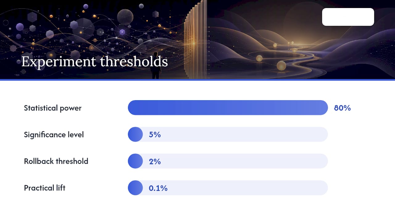
- Sample size estimate: calculate using a power calculator (Evan Miller's A/B test calculator is free and widely used). A typical setup targets 80% power and a 5% significance level.
- User segment: which users are included (new vs. returning, mobile vs. desktop, geography).
- Test duration: run for at least one full business cycle (usually 1–2 weeks) to avoid day-of-week bias.
- Rollback conditions: define in advance what result triggers an immediate rollback (e.g., conversion drops more than 2% in the control direction).
- Success criteria: the specific threshold the primary metric must cross for the fix to ship to 100%.
Statistical significance matters, but so does practical significance. A result that is statistically significant but represents a 0.1% lift on a low-volume page may not justify the maintenance cost. Pair your quantitative result with qualitative feedback from session replays during the test window to confirm the mechanism matches your hypothesis.
Stage 5: How do you monitor improvements and catch regressions early?
Shipping a fix is not the end of the cycle. Without monitoring, improvements regress silently as new code ships, content changes, or traffic patterns shift.
Core KPIs to track by flow:
| Flow | Primary KPI | Secondary KPIs | Alert threshold |
|---|---|---|---|
| Onboarding | Activation rate | Time-to-first-value, step drop-off | >5% week-over-week drop |
| Checkout | Conversion rate | Cart abandonment, error rate | >3% week-over-week drop |
| Core feature | Task success rate | Time-on-task, error rate | >10% drop vs. 30-day baseline |
| Performance | LCP, CLS | TTFB, FID | LCP >2.5s or CLS >0.1 |
| Support | Ticket volume by topic | CSAT, repeat contacts | >15% spike week-over-week |
Dashboard structure: organize your monitoring dashboard in three layers. The top layer shows overall product health (conversion, activation, retention). The middle layer shows per-flow KPIs mapped to specific pages or templates. The bottom layer shows recent experiment summaries with their status (running, shipped, rolled back).
Operational cadence:
- Daily: automated alerts for threshold breaches on Core Web Vitals and conversion rate. Assign one person to triage.
- Weekly: 30-minute funnel review with product and engineering. Flag any metric that moved more than the alert threshold and assign an owner.
- Quarterly: full usability audit of the top three flows. Recruit five external users, run moderated sessions, and feed findings back into the Diagnose stage.
The quarterly audit is the mechanism that restarts the cycle. Without it, teams monitor metrics but stop asking why they are what they are.
What are the quick wins you can ship in days?
These ten fixes address the most common friction points across web and mobile products. Each one takes less than a day for a single contributor.
- Rewrite CTA labels with action verbs and specific outcomes ("Start Free Trial," not "Get Started"). Affects every page with a conversion goal.
- Remove optional form fields from the primary path. Move them to a profile completion step post-signup.
- Add a loading spinner or progress indicator to every form submission and page transition. Users who see feedback wait; users who see nothing refresh.
- Fix primary button contrast to WCAG AA minimum (4.5:1 for normal text, 3:1 for large text). Use the WebAIM Contrast Checker — it is free.
- Lazy-load below-the-fold images using the native
loading="lazy"attribute. No library required. - Add inline validation on form fields so errors appear on blur, not on submit. Reduces form abandonment and support tickets.
- Prioritize the top three tasks on your home screen or dashboard. Move secondary features to a secondary navigation level.
- Add skip-to-content links for keyboard and screen reader users. One line of HTML and CSS.
- Audit and remove third-party scripts that are not actively used. Each one adds latency and increases CLS risk.
- Set explicit image dimensions in HTML to prevent layout shift during load. This alone can move your CLS score below 0.1.
For mobile-specific tactics, the mobile app development tips guide covers touch target sizing, gesture conflicts, and offline state handling that go beyond what a web checklist covers.
Which tools and templates support the full workflow?
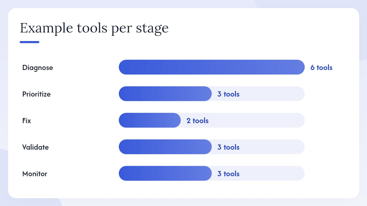
| Stage | Tool category | Example tools | Best for |
|---|---|---|---|
| Diagnose | Analytics | Google Analytics 4, Mixpanel, Amplitude | Funnel analysis, event tracking |
| Diagnose | Session replay / heatmaps | Hotjar, FullStory, Microsoft Clarity | Rage clicks, scroll depth, session review |
| Prioritize | Project management | Linear, Jira, Notion | Prioritization cards, backlog scoring |
| Fix | Prototyping | Figma, UXPin | Wireframes, interactive prototypes, design systems |
| Validate | A/B testing | Optimizely, VWO, Google Optimize | Split tests, multivariate tests |
| Monitor | Dashboards | Looker Studio, Datadog, Grafana | KPI dashboards, alert rules |
Starter vs. enterprise picks: small teams with under 10,000 monthly active users can run the full workflow with Google Analytics 4 (free), Microsoft Clarity (free), Figma (free tier), and a shared Notion board for prioritization cards. Enterprise teams with complex products and high traffic benefit from Amplitude's behavioral cohorts, FullStory's session intelligence, and UXPin's code-backed design system components that eliminate visual drift between design and engineering.
Templates to adapt:
- Prioritization card: a Notion or Jira template with fields for Evidence, Hypothesis, Experiment Idea, Effort, and Owner.
- Test-plan template: the fields listed in Stage 4 above, formatted as a shared doc your team fills in before any experiment starts.
- Usability test script: a five-task script with warm-up questions, task prompts, and a post-session rating scale (System Usability Scale works well for benchmarking).
- Rollout checklist: feature flag name, canary percentage, monitoring window (24–72 hours), alert thresholds, and rollback owner.
Consistent UI also reinforces brand recognition across touchpoints. For teams thinking about how design consistency connects to broader brand perception, the brand recognition guide covers how visual coherence builds user trust over time.
What do UI/UX improvements cost and how long do they take?
| Scope | Typical timeline | Roles required | Rough USD range (U.S. market) |
|---|---|---|---|
| Small (UI tweak, microcopy, contrast fix) | 1–5 days | Designer + frontend developer | — |
| Medium (flow redesign, form overhaul, A/B test) | 2–6 weeks | Designer + engineer + UX researcher | 10,000 |
| Large (platform performance, navigation redesign, design system) | 2–4+ months | Cross-functional team (PM, design, engineering, QA, research) | — |
These ranges assume U.S. market rates for in-house or agency talent. Freelance rates vary significantly by specialization and region. The minimum viable validation duration for any change is one full business cycle (7 days for most consumer products, 2 weeks for B2B with lower traffic). Skipping validation to save time is how teams ship regressions they do not notice for months.
Team-role checklist by scope:
- Small: one designer, one frontend developer, one stakeholder sign-off.
- Medium: add a UX researcher for usability testing and a product manager to own the hypothesis and success criteria.
- Large: add QA engineering, a data analyst for experiment analysis, and a program manager to coordinate handoffs. For regulated industries (fintech, health), add a compliance reviewer. The fintech implementation workflow guide covers compliance-specific handoff cadences in detail.
Handoff cadence matters as much as team composition. For medium and large scopes, run a design review before engineering starts, a mid-sprint check-in when the build is 50% complete, and a pre-launch review against the test-plan success criteria before expanding the rollout.
Key Takeaways
A repeatable 5-stage cycle — Diagnose, Prioritize, Fix, Validate, Monitor — delivers faster, lower-risk UI/UX gains than any single redesign, because each loop is small enough to measure and roll back.
| Point | Details |
|---|---|
| Start with diagnosis | Combine funnel analytics and session recordings before touching the interface to avoid redesigning the wrong surface. |
| Score before you build | Use the five-dimension matrix (Reach, Severity, Business impact, Effort, Risk) to rank issues and protect engineering time. |
| Validate every fix | Write a hypothesis with a measurable success criterion before running any A/B test or prototype session. |
| Monitor with a cadence | Run daily automated alerts, weekly funnel reviews, and quarterly usability audits to catch regressions before they compound. |
| Yslootahtech's approach | Yslootahtech applies this 5-stage cycle across UX/UI audits, phased rollouts, and validated prototypes for product teams. |
Why the "just redesign it" instinct is usually wrong
The most common mistake product teams make is treating a UX problem as a design problem when it is actually a measurement problem. A team that cannot tell you where users drop off, how long they spend on a task, or what error rate a specific field produces is not ready to redesign anything. They are ready to guess, and guessing is expensive.
The 5-stage cycle forces a different discipline. You cannot move to Prioritize until you have evidence. You cannot move to Fix until you have a hypothesis. You cannot ship to 100% until you have validated. That sequence feels slow to stakeholders who want visible progress, but it is actually faster than the alternative: a three-month redesign that ships to 100% of users on day one, breaks something unexpected, and requires a hotfix sprint.
There is also a subtler problem with big redesigns: they reset the user's mental model. Users who have learned your interface, even imperfectly, have invested cognitive effort. A full redesign asks them to reinvest that effort all at once. Phased improvements, by contrast, change one thing at a time, which means users adapt incrementally and rarely notice the transition. The product gets better; the user never feels lost.
The teams that get this right share one habit: they treat UX improvement as an operational discipline, not a project. They have a dashboard. They have a cadence. They have a backlog of scored issues. They ship small, validate fast, and monitor continuously. That is not a methodology. That is just how good product work gets done.
Yslootahtech's UX audit and design services for product teams
If your team has identified friction but lacks the bandwidth or tooling to run the full 5-stage cycle, Yslootahtech's UX/UI design services are built around exactly this workflow. The engagement starts with a diagnostic audit: a structured review of your analytics, session recordings, and heuristic evaluation that produces a prioritized issue list with effort estimates attached.
From there, the team moves into validated prototyping, phased rollouts with feature flags, and monitored releases against agreed KPIs. For teams exploring AI-assisted UX analytics or AI-accelerated design workflows, Yslootahtech's AI and machine learning services can layer behavioral prediction and anomaly detection onto your monitoring stack. The audit deliverable includes diagnostic highlights, a prioritized roadmap, and a rough effort estimate you can take directly into a sprint planning session. To request an audit, contact Yslootahtech through the UX/UI service page.
Further reading and authoritative sources
These sources back the methods and templates in this playbook. Cite them in internal proposals to give stakeholders confidence in the framework.
- Nielsen Norman Group — 10 Usability Heuristics: the primary reference for heuristic evaluation; use the heuristics as your diagnostic checklist and your validation criteria.
- Baymard Institute — UX Design Principles: research-backed principles with e-commerce depth; particularly strong on consistency, form design, and checkout optimization.
- UXPin — UX Design Principles: covers operationalizing principles into design systems and code-backed components; useful for the Fix and Tools stages.
- Figma — UI Design Principles: concise reference for scannability, visual hierarchy, and layout decisions; good for onboarding junior designers to the clarity checklist.
- Interaction Design Foundation — UX Design Process: a thorough primer on design thinking phases; useful background for teams new to structured UX process.
- Yslootahtech — UI/UX Design Process Playbook: step-by-step process guide for teams building or refining their UX workflow, with team-role and handoff guidance.