How to Optimize UI/UX Design for Product Teams

Six changes will do more for your interface than a full redesign: sharpen visual hierarchy, cut unnecessary steps, fix contrast ratios, tighten spacing, write better microcopy, and validate every change against one primary metric. Apply those in a single sprint and you will see measurable gains in task completion and conversion.
The highest-impact moves, at a glance:
- Fix contrast to meet WCAG 4.5:1 for body text
- Reduce form fields and flow steps to the minimum
- Establish a consistent type scale and 1.5 line-height
- Apply Jakob Nielsen's heuristics as a structured audit lens
- Build or adopt a component library in Figma for consistency
- Pick one primary metric (task completion, conversion, or activation) before shipping any change
Every tactic below ties to a validation method. Skip the ones that don't fit your sprint; run the rest.
Table of Contents
- How do you optimize UI/UX design in practice?
- What principles and validation methods actually drive UX improvement?
- What mistakes kill UX improvements before they ship?
- Key Takeaways
- The part most teams skip
- Yslootahtech's UI/UX service takes you from audit to shipped improvement
- Useful sources and further reading
How do you optimize UI/UX design in practice?
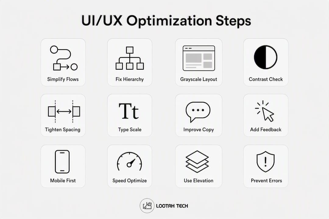
The answer is a prioritized list of concrete changes, each paired with a quick test. Here are twelve tactics, ordered by typical impact.
1. Simplify user flows
Every extra screen between a user and their goal costs you. Removing unnecessary steps is the single most consistent UX win practitioners report. Map the current flow, count the steps, then ask which ones you can merge or eliminate.
How to: (1) List every screen in the critical path. (2) Identify steps that exist for internal reasons, not user reasons. (3) Merge or remove them. (4) Re-test task completion time.
Quick check: Task completion rate before vs. after. Even a one-step reduction often moves the needle.
Before → After: Five-step checkout with a separate address confirmation screen → three-step checkout with inline address validation.
2. Fix visual hierarchy

Users scan before they read. Size, weight, and placement should guide the eye to the primary action first, secondary information second, and supporting detail last. If everything looks equally important, nothing is.
How to: (1) List the three most important elements on each screen. (2) Increase their size or weight relative to everything else. (3) Push secondary elements to a lower visual tier. (4) Run a five-second test: show the screen for five seconds and ask what the user noticed first.
Quick check: Five-second test recall accuracy. If fewer than 70% of testers name the primary element, the hierarchy needs work.
3. Start layout work in grayscale
Designing in grayscale first forces you to solve hierarchy and spacing before color enters the picture. Color applied to a broken layout just hides the problem.
How to: (1) Strip all color from the mockup. (2) Check that the layout still communicates priority clearly. (3) Add color only as an accent to reinforce decisions already made in structure.
Before → After: A dashboard where a red alert badge was the only visual anchor → a dashboard where size and position carry hierarchy, and color adds a secondary signal.
4. Fix contrast and meet WCAG minimums
Body text needs a 4.5:1 contrast ratio against its background; UI components and large text need at least 3:1. The WebAIM Million report consistently finds contrast failures among the most common accessibility errors on the web. Fixing them costs almost nothing and helps every user, not just those with visual impairments.
How to: (1) Run your screens through a contrast checker (Figma's built-in accessibility plugin or the browser DevTools accessibility panel). (2) Flag anything below threshold. (3) Adjust the lighter color toward the background's opposite. (4) Re-check.
Quick check: Zero contrast failures in your accessibility audit.
5. Tighten spacing and whitespace
Inconsistent margins and padding are the fastest way to make a polished design look amateur. Whitespace is not wasted space; it is the visual rhythm that lets users parse content without effort.
How to: (1) Define a spacing scale (4px, 8px, 16px, 24px, 32px is a common baseline). (2) Audit every component for deviations. (3) Enforce the scale in your Figma design system. (4) Check that related elements are closer together than unrelated ones (proximity principle).
Quick check: Eyeball the layout at arm's length. Uneven spacing jumps out immediately.
6. Establish a type scale
Random font sizes create visual noise. A defined type scale (e.g., 12/14/16/20/24/32px) with consistent line-height (1.5 for body text) makes reading effortless and signals professionalism. Consistent components in a design system help designers complete work 34% faster than those without one.
How to: (1) Audit all text styles currently in use. (2) Collapse them to a defined scale. (3) Apply 1.5 line-height to all body text. (4) Left-align body copy (centered text slows reading for long passages).
Quick check: Count distinct font sizes in your file. More than six is almost always too many.
7. Write better microcopy and onboarding prompts
Error messages that say "Something went wrong" teach users nothing. Onboarding prompts that explain features nobody asked about waste attention. Both are friction. Good microcopy names the problem, tells the user what to do next, and uses the user's own language.
How to: (1) Audit every error state and empty state. (2) Rewrite each to name the cause and the fix. (3) Cut onboarding tooltips to the one action the user needs right now. (4) Test comprehension with a five-second read.
Before → After: "Error 403" → "You don't have permission to view this page. Contact your admin to request access."
8. Add interaction feedback and affordances
Buttons that don't change on hover, form fields with no focus state, and actions with no loading indicator all break the user's mental model. Nielsen's heuristic on system status visibility is the most violated of the ten: users need to know the system received their input.
How to: (1) Audit every interactive element for hover, focus, active, and disabled states. (2) Add a loading indicator to any action that takes more than 300ms. (3) Use color and shape together for state changes (never color alone).
Quick check: Tab through the entire interface with keyboard only. Every interactive element should be reachable and visually distinct when focused.
9. Apply responsive and mobile-first tactics

More than half of web traffic arrives on mobile, yet most design work starts on desktop. Tap targets smaller than 44×44px, text that requires pinching, and modals that overflow the viewport are all conversion killers. A solid mobile app design workflow starts with the smallest screen and scales up.
How to: (1) Design the mobile layout first. (2) Set minimum tap target size to 44×44px. (3) Test on a real device, not just a browser resize. (4) Check that no content is hidden behind a keyboard on mobile.
Quick check: Run Google Lighthouse on mobile. A performance score below 75 usually signals UX problems, not just speed problems.
10. Optimize for load speed
Slow interfaces feel broken. A page that takes more than three seconds to load on mobile loses a significant share of users before they see a single pixel of your design. Largest Contentful Paint (LCP) under 2.5 seconds and Time to Interactive (TTI) under 3.8 seconds are the targets Google's Core Web Vitals set for a "good" experience.
How to: (1) Run Lighthouse or WebPageTest. (2) Compress images and use modern formats (WebP, AVIF). (3) Defer non-critical JavaScript. (4) Prioritize above-the-fold content loading.
Quick check: LCP and TTI scores in Lighthouse. Fix the largest offenders first.
11. Use shadows and elevation intentionally
Shadows communicate surface relationships. A card that casts a shadow sits above the background; a modal with a heavy shadow sits above the card. Inconsistent shadow usage breaks the spatial logic users rely on to understand what is interactive and what is static.
How to: (1) Define two or three elevation levels (flat, raised, floating). (2) Use a single consistent light source (top-left is convention). (3) Reserve the heaviest shadow for the highest-priority interactive surface.
12. Prevent errors and make recovery easy
Inline validation that fires after a user leaves a field is less disruptive than a full-page error on submit. Confirmation dialogs for destructive actions (delete, cancel, send) prevent the kind of mistakes that erode trust permanently.
How to: (1) Add inline validation to all form fields. (2) Validate on blur, not on submit. (3) Write confirmation copy that names the consequence ("Delete this project? This cannot be undone."). (4) Offer an undo option wherever technically feasible.
Pro Tip: Run a five-minute "cognitive walkthrough" on your own product once a month: open the app cold, pick the most common user task, and narrate every decision aloud. You will find friction you stopped noticing.
What principles and validation methods actually drive UX improvement?
Tactics without principles are guesses. The two frameworks that underpin almost every effective UI/UX optimization are Nielsen's heuristics and structured hypothesis testing.
Nielsen's heuristics as an audit lens
Jakob Nielsen's 10 usability heuristics give you a structured vocabulary for diagnosing interface problems. Each maps to a measurable outcome:
- Visibility of system status → task success rate, error rate
- Match between system and real world → comprehension test scores
- User control and freedom → undo/redo usage, abandonment rate
- Consistency and standards → time on task (inconsistency slows users)
- Error prevention → error rate, support ticket volume
- Recognition over recall → task completion without help
- Flexibility and efficiency → power-user task time vs. novice task time
- Aesthetic and minimalist design → time-to-complete, cognitive load ratings
- Help users recognize, diagnose, and recover from errors → recovery rate
- Help and documentation → help-page visits as a proxy for confusion
Figma's advocacy director Thomas Lowry frames the designer's role as navigation: treat every screen like a page in a well-structured book, using titles, breadcrumbs, and clear navigational cues so users never feel lost. That framing maps directly to heuristics 1, 3, and 6.
Accessibility as a baseline, not a bonus
WCAG sets the floor: 4.5:1 contrast for body text, 3:1 for large text and UI components. Accessibility improvements also carry SEO and inclusion benefits that compound over time. Inclusive design, including inclusive design statements, signals intent and keeps teams accountable.
A validation workflow that works
Treat every UI change as a falsifiable hypothesis. Define your success metric and the threshold for "success" before you ship — not after you see the numbers.
Workflow: (1) Write the hypothesis ("Reducing form fields from 8 to 5 will increase submission rate by at least 10%"). (2) Pick one primary metric. (3) Set a minimum sample size (for most product teams, 200–400 sessions per variant is a workable starting point for directional confidence). (4) Run an A/B test or a pre/post comparison. (5) Record the result, win or loss, in a shared log.
Pro Tip: Archive failed hypotheses. A change that did not move the metric is still information. Teams that document losses avoid re-running the same dead-end experiments six months later.
Metrics reference
| Metric | Target | Where to measure |
|---|---|---|
| Task completion rate | — | Usability test, session replay |
| Time on task | Baseline + 20% improvement | Usability test |
| LCP (Largest Contentful Paint) | <2.5 seconds | Lighthouse, WebPageTest |
| TTI (Time to Interactive) | <3.8 seconds | Lighthouse |
| Contrast ratio (body text) | ≥4.5:1 | Figma plugin, DevTools |
| Form completion rate | Baseline + 10% | Analytics funnel |
| Error rate | <5% of sessions | Session replay, analytics |
What mistakes kill UX improvements before they ship?
Most optimization efforts fail not because the idea was wrong but because the execution had a preventable flaw. These are the patterns that show up repeatedly.
- Over-relying on color alone to communicate state (fails for colorblind users and in bright-light conditions)
- Inconsistent spacing that makes a design feel unfinished even when the content is strong
- No defined type scale, leading to 10+ font sizes that create visual noise
- Missing affordances: buttons that look like text, links that look like buttons, and form fields with no visible border
- Unnecessary steps left in flows because removing them requires engineering effort nobody scheduled
- Ignoring mobile constraints: tap targets too small, modals that overflow, text that requires zooming
- Vague error messages that tell users something failed without telling them what to do
A 10-minute QA checklist before you ship
Run this before any design goes to development:
- All body text passes 4.5:1 contrast check
- All UI components pass 3:1 contrast check
- Tap targets are at least 44×44px on mobile
- Every interactive element has hover, focus, active, and disabled states
- Form fields validate inline, on blur
- Error messages name the cause and the fix
- Onboarding copy is cut to the single next action
- Spacing follows the defined scale (no one-off values)
- Type scale has no more than six distinct sizes
- The interface is navigable by keyboard alone
Pro Tip: The squint test catches hierarchy problems in seconds. Blur your eyes or squint at the screen from a distance. The element your eye lands on first is the one with the most visual weight. If that is not the primary action, fix the hierarchy before anything else.
When to test vs. when to ship
Small, low-risk changes (fixing a contrast ratio, correcting a typo in an error message, tightening spacing) can ship immediately. Changes that affect the critical conversion path, restructure navigation, or remove a step from a key flow need at least a directional A/B test or a moderated usability session before going to production. The business impact of UX optimization compounds when teams build a habit of testing the big bets and shipping the small fixes fast.
Key Takeaways
Fixing contrast, cutting flow steps, and validating every change against one primary metric are the three moves that deliver the fastest, most measurable UX gains.
| Point | Details |
|---|---|
| Fix contrast first | Body text needs 4.5:1 contrast ratio; UI components need 3:1 per WCAG. |
| Cut steps, not just pixels | Removing unnecessary flow steps is the most consistent UX improvement practitioners report. |
| Validate with one metric | Define your success threshold before shipping; archive every result, win or loss. |
| Design systems speed delivery | Teams with a Figma design system complete design work 34% faster than those without one. |
| Yslootahtech for deeper work | Yslootahtech's UI/UX service runs discovery, sprint-based testing, and implementation for product teams that need more than a checklist. |
The part most teams skip
The tactics in this guide are not secret. Contrast ratios, spacing scales, and hypothesis-driven testing are documented everywhere. What separates teams that actually improve their products from teams that read about improving them is one thing: they treat every change as an experiment with a recorded outcome.
Most organizations run a redesign, ship it, and move on. They never know whether the new flow performed better because the design improved or because they launched it alongside a marketing campaign. That ambiguity is expensive. It means the next decision is made on the same incomplete information as the last one.
The teams that compound improvements over time do three things differently. They pick one metric per change. They set the success threshold before they look at the data. And they write down what happened, including the failures, so the next sprint starts from a higher baseline.
The discover-test-scale loop is not a methodology you need to buy or certify. It is a discipline. Run a small usability session, ship the change, measure the metric, write it down. Repeat. The web design decisions that move business metrics are almost always the ones that came from that loop, not from a single inspired redesign.
Yslootahtech's UI/UX service takes you from audit to shipped improvement
Knowing what to fix and having the capacity to fix it are two different problems. Yslootahtech's UI/UX practice works with product teams that have identified friction in their interfaces but need structured discovery, sprint-based prototyping, and engineering-ready handoffs to move from diagnosis to production.

The engagement typically starts with a focused audit: map the critical user flows, run contrast and accessibility checks, identify the highest-friction steps, and define the primary metric for each fix. From there, the team moves into a design sprint, prototypes the changes in Figma, and validates with real users before a single line of code is written. The result is a prioritized backlog of tested, measurable improvements rather than a list of opinions.
If your product needs a structured UX audit or a full UI/UX design engagement, reach out to Yslootahtech to scope a pilot sprint. Teams that need engineering support alongside design can also explore the application development service for end-to-end delivery.
Useful sources and further reading
The sources below are the primary references behind this guide. Each is worth bookmarking.
- Jakob Nielsen's 10 Usability Heuristics (NN/g) — The foundational audit framework for evaluating any interface. Use it as a structured checklist before every major release.
- 7 Key UI Design Principles (Figma) — Covers hierarchy, navigation, and design system value with practical examples from Figma's own advocacy team.
- WCAG 2.1 Guidelines (W3C) — The authoritative source for contrast ratios, keyboard navigation requirements, and accessibility standards. Every team should have this bookmarked.
- SaaS UX Optimization (GrowthLayer) — Practitioner-level guidance on hypothesis-driven testing and friction removal, with concrete examples from SaaS products.
- 16 Little UI Design Tips (Adham Dannaway) — Fast, visual, and immediately applicable. The contrast and line-height tips alone are worth the read.
- WebAIM Million Report — Annual accessibility audit of the top one million websites. The contrast failure data is sobering and a strong argument for fixing it early.
- Design Principles for Software Engineers (Blake Crosley) — Covers modern CSS patterns (scroll-driven animations, dark mode, anchor positioning) that reduce JavaScript dependency and improve perceived performance.
Good UI/UX optimization is not about making things pretty. It is about removing every obstacle between a user and the outcome they came for — and measuring whether you actually did.