Enterprise Design System: ROI, Governance & Implementation

An enterprise design system is a living, company-wide product that packages design tokens, coded components, interaction patterns, documentation, and governance into reusable, measurable infrastructure. Unlike a style guide or pattern library, it spans multiple products, platforms, and brands simultaneously.
Three things to know before you read further:
- It is a product, not a project. It needs a product manager, a release cadence, and OKRs, or it will stall within 18 months.
- Governance is the differentiator. The technical artifacts are table stakes. What separates a system that scales from one that fragments is the contributor model and the deprecation policy.
- ROI is measurable. Teams that instrument adoption and time-to-implement before rollout can show leadership concrete hours saved, defect reductions, and CSAT improvements.
The anatomy of an enterprise-grade system: tokens → coded components → patterns → documentation → governance → telemetry.
Key Takeaways
A well-governed enterprise design system is the highest-leverage infrastructure investment a product organization can make, provided it is staffed as a product and measured from day one.
| Point | Details |
|---|---|
| Governance over components | A contribution model, deprecation policy, and review SLA matter more than component count for long-term adoption. |
| Token architecture first | Adopt semantic token naming and the designtokens.org format before building components to avoid costly renames later. |
| Measure before and after | Baseline time-to-implement and defect counts before rollout so ROI claims are credible to leadership. |
| Incremental migration wins | Use a strangler approach: adopt the system on new screens and refactor legacy screens on natural release cycles. |
| Yslootahtech as your partner | Yslootahtech delivers end-to-end design system engagements, from token architecture and component engineering to governance setup and AI-readiness pipelines. |
Table of Contents
- What an enterprise design system actually is (and what it is not)
- Core components every enterprise design system must include
- Business benefits and how to make the ROI case to executives
- Governance, roles, and contributor models that actually hold at scale
- A practical implementation roadmap from audit to maintenance
- Recommended tooling and how design systems fit into engineering workflows
- Accessibility and localization at enterprise scale
- KPIs, telemetry, and case studies showing measured outcomes
- Public enterprise design systems worth studying
- Near-term trends shaping enterprise design systems
- Common mistakes that derail enterprise design systems
- What most organizations get wrong about enterprise design systems
- How Yslootahtech helps enterprises build and operate design systems
- Sources
What an enterprise design system actually is (and what it is not)
The confusion between a design system, a style guide, and a pattern library is not semantic. According to Nielsen Norman Group, a design system is the parent that encompasses style guides, component libraries, and pattern libraries. Conflating them leads to under-resourced systems nobody uses.
A style guide documents visual rules: colors, typography, spacing, brand voice. A pattern library catalogs reusable UI patterns, often as static screenshots. Neither includes code, neither ships tokens, and neither has a governance model. They solve documentation problems. A design system solves a production problem.
An enterprise design system goes further still. It must handle multi-product, multi-brand, and multi-platform requirements simultaneously. That means machine-readable artifacts (design tokens in a standardized format), coded components for web and native platforms, and a governance layer that lets dozens of teams contribute without breaking the system for everyone else.
When should you invest in a full system versus a style guide? A style guide is sufficient when you have one product, one platform, and a small team. Once you cross two or more products, two or more platforms, or a team size where design drift is visibly hurting quality, the style guide stops scaling. That is the inflection point where a productized system pays for itself.
Core components every enterprise design system must include
Every enterprise system needs the same foundational layer, regardless of the tech stack or the industry. The table below maps each component to its purpose and the artifact teams should produce.
| Component | Purpose | Primary Artifact |
|---|---|---|
| Design tokens | Single source of truth for color, spacing, typography, motion | Token JSON/YAML files, synced to design tool and code |
| Coded component library | Reusable, tested UI components for web and native | npm package(s), versioned releases |
| Patterns and templates | Composed, cross-component workflows (forms, onboarding, dashboards) | Figma frames + coded page templates |
| Documentation | Usage guides, API references, naming conventions, migration notes | Docs site (e.g., Storybook, Zeroheight, custom) |
| Governance tools | Contribution process, versioning, release cadence, changelogs | CONTRIBUTING.md, GitHub PR templates, release notes |
| Platform coverage | Web (React, Vue, Angular), iOS, Android, native wrappers | Platform-specific packages or wrappers |
Design tokens are the foundation. Color, spacing, typography, and motion values live as named, structured variables rather than hardcoded hex codes. The Designtokens define a tool-agnostic, machine-readable format that lets tokens move cleanly between Figma, code, and any future tooling without manual translation.
Coded component libraries are where the real leverage lives. A component built once, tested once, and shipped to every team eliminates the parallel-implementation problem that quietly costs enterprises thousands of engineering hours per year. The link between design files and code must be explicit: a Figma component should map 1:1 to a coded component, with the same name, the same props, and the same token references.
Patterns and templates sit above components. A "create account" flow is a pattern. A dashboard shell is a template. These are where product teams save the most time, because they eliminate the need to compose components from scratch for every new screen.
Documentation is not optional at enterprise scale. Engineers need API references. Designers need usage guidelines. Product managers need migration notes when components are deprecated. Without a living docs site, the system becomes tribal knowledge, and tribal knowledge does not scale.
Business benefits and how to make the ROI case to executives
The Figma research on design system business cases shows teams are now tying system work directly to customer health metrics: adoption rates, retention, and CSAT. That shift matters because it moves the conversation from "design efficiency" to "product quality," which is a language executives understand.
Four pillars map to leadership priorities:
- Speed. Measure time-to-implement a new UI feature before and after the system. Teams consistently report significant reductions in implementation time once a component library reaches critical mass.
- Cost. Count the engineering hours spent building duplicate components across products. Multiply by fully loaded hourly cost. That number is your baseline investment justification.
- Quality. Track UI defect counts and accessibility regression rates. A well-governed system with baked-in WCAG compliance reduces defects at the source rather than catching them in QA.
- Brand coherence. Measure visual inconsistency through design audits before and after. Inconsistency correlates with lower user trust, which shows up in CSAT and NPS data.
Building the ROI formula. Smashing Magazine's published ROI formula walks through a multi-year model that accounts for both gains (hours saved, defects avoided) and ongoing maintenance costs. The key insight: maintenance costs are real and must be modeled honestly, or the ROI case falls apart when leadership asks about year two and three.
A simple baseline calculation:
- Count the number of UI components duplicated across products.
- Estimate average hours to build and maintain each component per team per year.
- Multiply by the number of teams and the fully loaded hourly rate.
- Subtract the estimated annual cost of running the design system team.
- The remainder is your gross annual savings.
For a budget request, assemble: component audit results, a baseline time-to-implement measurement, current defect counts by UI category, and any existing CSAT data tied to UI quality. That evidence package answers every question a CFO will ask.
Statistic callout: Figma's research documents teams reporting measurable operational gains and cost reductions after aligning design system work to customer metrics, with the strongest results coming from teams that tracked adoption and fidelity from day one.
Governance, roles, and contributor models that actually hold at scale
Governance is where most enterprise systems fail. The technical work gets done, and then the system slowly drifts because nobody owns the contribution process or the deprecation policy.
Three organizational models:
- Centralized. A dedicated team owns everything: tokens, components, documentation, releases. Fast to start, consistent, but creates a bottleneck as the number of consuming teams grows. Works well for organizations with fewer than five product teams.
- Federated. Each product team owns its own layer and contributes back to a shared core. Scales well but risks fragmentation if the core team is too small to review contributions rigorously.
- Hybrid. A central core team maintains governance and critical components; federated contributors own product-specific layers and localized patterns. NN/g's practitioner research identifies this as the most sustainable model for large organizations.
Minimum roles for a healthy system:
- Design system product manager. Owns the roadmap, OKRs, and stakeholder communication. Without this role, the system gets deprioritized every time a product team has a deadline.
- Design lead. Owns token architecture, component design, and visual consistency.
- Engineering steward. Owns the codebase, release pipeline, and developer experience.
- Adoption advocate(s). Embedded in product teams, they drive onboarding, answer questions, and surface friction back to the core team.
- Accessibility and localization reps. Ensure WCAG compliance and RTL/localization requirements are built into components, not bolted on later.
Contribution workflow essentials:
- A clear intake process: GitHub issue templates or a request form for new components or token changes.
- A review SLA: contributors must know how long a PR review will take. Two weeks is the outer limit before teams stop contributing and build their own solutions.
- Versioning and changelogs: semantic versioning (major/minor/patch) with human-readable release notes for every release.
- A deprecation policy: components get a deprecation notice with a migration guide and a removal date, never a silent deletion.
Pro Tip: Set a contribution SLA in your CONTRIBUTING.md file and publish it on your docs site. When teams know a PR will be reviewed within five business days, they plan migrations accordingly and stop building workarounds that become technical debt.
A practical implementation roadmap from audit to maintenance
The most common mistake is starting with components before finishing the token strategy. The steps below are ordered to prevent that.
- Discovery and audit (weeks 1–4). Inventory every UI component, color value, and spacing unit across all products. Count duplicates. Identify the 20 components that appear most frequently. This audit is the evidence base for your ROI case and your component prioritization.
- Token strategy (weeks 3–6, overlaps with audit). Define your token taxonomy: global tokens (raw values), alias tokens (semantic names like
color-background-primary), and component tokens (scoped to a specific component). Adopt the designtokens.org format from the start for portability. - Component prioritization (week 5–6). Rank components by frequency of use and complexity. Build the top 10–15 first. Resist the urge to build everything before shipping anything.
- Pilot implementation (weeks 7–14). Partner with one product team to implement the system on a new feature or screen. This surfaces real integration friction before you scale. Document every issue and fix it before the broader rollout.
- Expand and migrate (months 4–9). Roll out to additional teams using a "strangler" approach: adopt the system on new screens and refactor legacy screens on natural release cycles. Smashing Magazine's ROI guide specifically recommends this incremental migration over a big-bang replacement.
- Governance setup (months 3–5, parallel to pilot). Publish your CONTRIBUTING.md, establish the review SLA, and set up the release pipeline. Governance must be in place before you scale adoption, not after.
- Telemetry and feedback loops (month 6 onward). Instrument component usage, track adoption rates by team, and run quarterly surveys with consuming teams. Use this data to prioritize the roadmap and report progress to leadership.
For a startup-scale org (one to three product teams), this roadmap compresses to roughly six months. For a scaled enterprise with ten or more product teams, plan for 12–18 months to reach meaningful adoption. Refer to the enterprise application deployment guide for parallel rollout considerations that apply to large-scale system launches.
Recommended tooling and how design systems fit into engineering workflows
The toolchain matters less than the discipline of keeping design files and code in sync. That said, certain tools have become the practical standard.
Figma as the design source
Figma is the dominant design tool for enterprise systems. Structure your Figma workspace with an org-level library: one file for tokens (color styles, text styles, effect styles), one file per component category, and a separate file for patterns and templates. Enable "Publish styles and components" at the library level so all product teams consume from a single source. Use Figma's variable system for token management, mapping directly to your token JSON files.
Storybook for component development and QA
Storybook is the standard for developing, documenting, and testing UI components in isolation. Every component gets a story that shows its variants, states, and edge cases. Storybook serves three audiences simultaneously: engineers building components, QA engineers testing them, and product teams previewing them before integration. It also generates interactive documentation that stays in sync with the code.
GitHub for version control and release automation
GitHub is the backbone of the engineering workflow. Use a monorepo for the component library when you have one primary framework, and a polyrepo when you maintain separate packages for web, iOS, and Android. Set up automated releases using tools like semantic-release or Changesets, which generate changelogs and publish packages to npm on merge to main. PR templates should require a changelog entry, a Storybook story update, and an accessibility check before review.
Token pipelines from design to code
The token pipeline is the automation layer that keeps design and code in sync. A tool like Style Dictionary transforms your token JSON files into platform-specific outputs: CSS custom properties for web, Swift constants for iOS, Kotlin constants for Android. When a designer updates a token value in Figma, the change flows through the pipeline to every platform without manual translation. This is where the designtokens.org format standard pays off: a tool-agnostic format means you can swap design tools or code frameworks without rebuilding the pipeline.
CI/CD for component releases
Every component release should go through a CI/CD pipeline: lint, unit tests, visual regression tests (tools like Chromatic integrate directly with Storybook), accessibility checks (axe-core), and automated docs generation. This pipeline is what makes the system trustworthy. Teams adopt components they can rely on; they build workarounds for components that break silently.
For teams connecting design system automation to broader enterprise software tooling decisions, the same CI/CD discipline applies across the stack.
Accessibility and localization at enterprise scale
Accessibility and localization are not post-launch concerns. Building them into components from the start costs a fraction of retrofitting them later.
Accessibility standards and component-level enforcement:
- Follow WCAG as the baseline standard for all components. Target WCAG 2.1 AA as the minimum, with WCAG 2.2 AA as the current target for new work.
- Every component must ship with correct ARIA roles, labels, and keyboard navigation patterns baked in. A button component that fails keyboard focus is a system defect, not a product team's problem to solve.
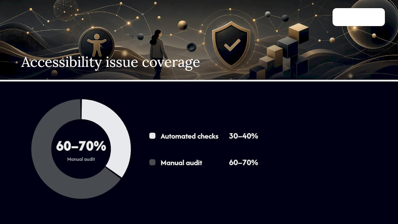
- Run axe-core or a comparable automated accessibility checker in CI on every component PR. Automated checks catch roughly 30–40% of accessibility issues; the remainder require manual audit.
- Maintain a manual audit schedule: test with screen readers (NVDA, JAWS, VoiceOver) at least once per major release cycle.
- Include color contrast ratios in your token documentation. Every color token pair (foreground/background) should have its contrast ratio listed so designers can make compliant choices without manual calculation.
Localization workflow:
- Tokenize all copy strings. Hard-coded text in components is a localization blocker. Every user-facing string should reference a key in a language pack.
- Build RTL support into the layout system from day one. CSS logical properties (
margin-inline-startinstead ofmargin-left) handle most RTL layout automatically and are far cheaper than retrofitting. - Include linguists in the component review process for any component that contains user-facing text. A linguist review catches truncation issues, gender agreement problems, and cultural sensitivities before they reach production.
- Maintain a locale/device test matrix. At minimum, test each component in English (LTR), Arabic or Hebrew (RTL), and a CJK language (Japanese, Chinese, or Korean) to surface layout and typography edge cases.
Operational tips for global rollout:
- Region-specific theming (different color palettes for different markets) is handled cleanly with alias tokens. The global token values change per region; the alias token names stay constant.
- Legal and regulatory sensitivity checks (cookie consent UI, financial disclosures, accessibility mandates by jurisdiction) should be part of the component review checklist for any component used in regulated flows.
- Performance budgets matter for global users. Components should be tree-shakeable so teams in bandwidth-constrained markets don't load the entire library for a single button.
KPIs, telemetry, and case studies showing measured outcomes
Measuring a design system's impact requires two baselines: one before rollout and one at a defined point after. Teams that skip the pre-rollout baseline cannot show credible impact.
Primary KPIs to track:
| KPI | What it measures | How to instrument |
|---|---|---|
| Component adoption rate | Percentage of product teams using at least one system component | Usage analytics in Figma + npm download data |
| Time-to-first-component | Hours from design handoff to coded component in production | Engineering time tracking, pre/post comparison |
| UI defect count | Bugs filed against UI components per sprint | Jira/Linear labels, filtered by UI category |
| Accessibility regression rate | New WCAG failures introduced per release | axe-core CI reports, tracked over time |
| Design fidelity score | How often teams modify components after adoption | Figma analytics, component detach rate |
Figma's design system ROI measurement guide recommends tracking both adoption (how many teams use components) and fidelity (how often teams modify components after adoption). High adoption with low fidelity means the system is working. High adoption with high fidelity means components are not flexible enough, and teams are detaching to customize.
Sample dashboard fields for designers and PMs:
- Total components in the system vs. components in active use
- Adoption rate by product team (heat map)
- Average time-to-implement, trended monthly
- Open contribution requests and average review time
- Accessibility regression count per release
Case study signals from public enterprise systems. Atlassian's public design system documentation shows a mature token and component architecture that supports multiple products (Jira, Confluence, Trello) from a single system. SAP's design system explicitly supports cross-platform enterprise applications and is actively adding AI guidance, which signals where enterprise systems are heading. IBM's Carbon Design System publishes open component docs and accessibility practices that teams can study directly. These are not marketing claims; they are inspectable public artifacts. The Figma blog's business case research documents teams reporting measurable operational improvements and cost reductions after connecting system work to customer metrics.
For additional context on how enterprise applications translate system investments into operational outcomes, the enterprise app examples guide covers cross-industry case patterns worth reviewing alongside your own baseline data.
Public enterprise design systems worth studying
Each of these systems is publicly inspectable. The lesson listed is the single most transferable insight for teams building their own.
- Figma's Material Design (Google). The most widely studied public system. The lesson: token architecture done at scale. Material 3 uses a three-tier token system (reference, system, component) that is worth mapping to your own taxonomy before you write a single token.
- Atlassian Design System. Multi-product governance done well. Atlassian supports Jira, Confluence, and Trello from one system. Study their component naming conventions and their public contribution guidelines, which are unusually transparent about how they handle external requests.
- SAP Fiori / SAP Design System. Enterprise-grade, cross-platform, and now actively publishing AI guidance. The lesson: SAP shows what it looks like to maintain a system at the scale of a global ERP vendor. Their platform coverage (web, mobile, desktop, native) is a useful benchmark for organizations with similarly complex platform requirements.
- IBM Carbon Design System. Open source, React-first, with strong accessibility documentation. The lesson: Carbon's accessibility implementation is among the most thorough publicly available. Every component ships with keyboard navigation specs, screen reader guidance, and WCAG mapping. Use it as a reference for your own accessibility documentation standard.
- Ant Design. The dominant enterprise system in the React ecosystem for data-heavy applications. The lesson: Ant Design's component density (tables, forms, data visualization) shows how to handle complex, data-rich UI patterns that most systems underserve. If your product is a dashboard or an admin tool, Ant Design's pattern library is required reading.
- Polaris (Shopify). A single-product system that punches above its weight on documentation quality. The lesson: Polaris's usage guidelines are written for product designers, not just engineers. Each component page explains when to use it, when not to use it, and what to use instead. That level of guidance is what separates a system teams trust from one they ignore.
- HPE Design System. Less cited than the others but worth studying for its open governance model and its approach to theming across HPE's product portfolio. The lesson: HPE shows how a hardware-and-software company handles the design system problem when the product surface spans physical and digital interfaces.
Near-term trends shaping enterprise design systems
Three forces are reshaping how enterprise systems are built and consumed, and decision-makers who ignore them will be rebuilding their systems in three years.
Agentic AI and machine-readable systems. The most significant near-term shift is the move toward agent-ready artifacts. Projects like Facebook's Astryx on GitHub represent the direction: systems where tokens, components, and metadata are structured so that AI agents can compose UI programmatically. For your system, this means semantic naming matters more than ever. A token named color-feedback-error is agent-readable. A token named red-500 is not. Teams that invest in semantic metadata now will be positioned to plug into AI-driven composition tools as they mature. For a broader view of how AI is reshaping enterprise tooling decisions, the AI integration guide for business leaders covers the strategic framing worth reading alongside your system roadmap.
Token standardization and cross-tool portability. The designtokens.org format specification is moving toward a stable, tool-agnostic standard. Once it reaches broad adoption, tokens will move cleanly between Figma, code, and any future design tool without custom pipelines. Teams that adopt the format now avoid a migration later. This also enables AI-driven brand strategies, where token sets drive personalized theming at scale, a pattern explored in AI-driven brand building approaches.
Modular architecture and multi-brand orchestration. Enterprises with multiple brands or product lines are moving toward modular systems: a shared core layer of primitive tokens and base components, with brand-specific layers that override values without forking the codebase. This pattern lets a single engineering team maintain one system that powers five brands. The practical implementation uses alias tokens at the brand layer, so color-background-primary resolves to different values for each brand while the component code stays identical.
Practical futureproofing steps:
- Adopt semantic token naming now, even if you are not yet using AI tooling.
- Publish your token files in the designtokens.org format.
- Add metadata to component documentation: purpose, usage context, and accessibility requirements in structured fields, not just prose.
- Set up CI hooks that validate token naming conventions on every PR, so naming drift does not accumulate silently.
Common mistakes that derail enterprise design systems
Most system failures are organizational, not technical. The technical problems are solvable. The organizational ones compound.
- Treating the system as a one-time project. A design system that ships version 1.0 and then goes into maintenance mode is a system that will be abandoned within 18 months. It needs a product roadmap, quarterly OKRs, and a dedicated team with protected capacity.
- Under-investing in documentation. Engineers adopt components they can understand in five minutes. If the docs site requires reading the source code to understand how to use a component, adoption stalls. Documentation is a first-class deliverable, not a post-launch task.
- Over-bureaucratizing contributions. A contribution process that requires three approval stages and a design review committee for every token change will kill federated contribution. Keep the process lightweight for low-risk changes (token value updates, documentation fixes) and reserve the heavy review for new components or breaking changes.
- Ignoring measurement. Teams that cannot show adoption rates, time savings, or defect reductions lose budget in the next planning cycle. Instrument the system from day one, even with simple metrics.
- Brittle tokens and inconsistent naming. Tokens named after their visual value (
blue-600,16px) rather than their semantic role (color-interactive-primary,spacing-component-padding) break every time the visual design changes. Rename them before they proliferate. - Poor versioning discipline. Shipping breaking changes without a major version bump, or without migration guides, destroys trust with consuming teams. Once a team gets burned by a silent breaking change, they pin their dependency and stop upgrading.
- Skipping the pilot phase. Rolling out to all product teams simultaneously before the system is proven in production is the fastest way to generate political resistance. One successful pilot team is worth more than ten theoretical endorsements.
What most organizations get wrong about enterprise design systems
The conventional wisdom says the hard part of a design system is the component library. Build the components, publish the docs, and adoption will follow. That is wrong in a specific, predictable way.
The hard part is product management. A system without a PM is a system that responds to whoever shouts loudest, ships components that solve the wrong problems, and has no way to say no to requests that would fragment the architecture. The teams that sustain positive ROI over a three-year horizon are the ones that staff the system like a product: with a roadmap, a backlog, and a clear definition of what the system is and is not responsible for.
The second misconception is that top-down mandates drive adoption. They do not. A mandate that says "all new UI must use the design system" without an adoption program, embedded advocates, and training creates resentment and workarounds. What actually works is a mix: make the system genuinely easier to use than building from scratch, embed advocates in product teams who can answer questions in real time, and tie system adoption to team-level metrics that matter to engineering managers.
Realistic expectations matter here. A 12–24 month maturity curve is normal. Month three looks like a pilot with one team and a token architecture that is mostly right. Month twelve looks like four or five teams using the system, a contribution workflow that mostly works, and a measurement dashboard that is starting to show trends. Month twenty-four looks like broad adoption, a self-sustaining contribution model, and a business case you can defend to a CFO. Teams that expect full adoption in six months build the wrong system and then blame the system.
How Yslootahtech helps enterprises build and operate design systems
Building a design system from scratch while running product teams is genuinely hard. Yslootahtech works with enterprises to scope, architect, and deliver design systems that are production-ready from day one: token architecture, coded component libraries, Storybook documentation, governance setup, and adoption programs tailored to your org structure.
The difference is cross-industry depth. Yslootahtech's portfolio spans fintech, digital health, e-commerce, and industrial platforms, which means the team has seen the edge cases that generic frameworks miss: multi-brand token orchestration, RTL localization pipelines, and CI/CD patterns for regulated industries. The UX/UI design services include design-to-code handoff expertise, and the AI and machine learning services cover the agent-readiness and automation layer that forward-looking systems need. If you are ready to scope a pilot engagement or audit your existing system, contact Yslootahtech to start the conversation.
Sources
These sources are worth bookmarking by role: standards bodies for compliance work, practitioner publications for strategy, and public repos for implementation patterns.
Standards and specifications:
- Design systems vs. style guides - NN/g
- The New Business Case For Design Systems | Figma Blog
- Designtokens
Strategy and ROI:
Definitions and scope:
Public system repos and docs (for implementation patterns):